Logos
Description
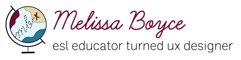
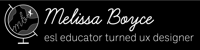
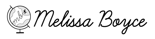
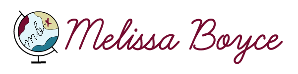
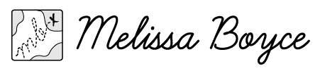
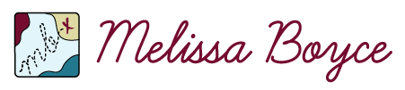
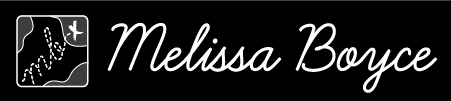
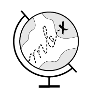
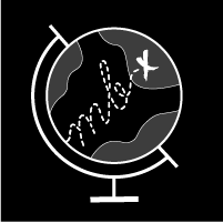
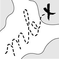
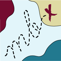
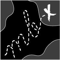
My logo was made to signify my journey from being an ESL educator to a UX designer. The globe represents my interest in and awareness of multiculturalism. It also symbolizes my past as a teacher. The letter mark of my initials "mb" are dashed, representing a path, one that is traveling across the globe. The "x" suggests UX design as my destination, but also alludes to the whole journey being an experience. The typeface "Learning Curve" was used as it is a beautiful cursive script font reminiscent of the type you would see in classrooms as a child when learning cursive. I used "Ballinger" as the typeface for my slogan. Both of these typefaces along with the teal, burgundy, and gold color palette lend to a professional but friendly vibe.
Usage
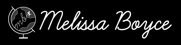
The black and white logos are meant to be used for monochrome views and to increase contrast. The color logos are the default logos meant to be used on a white background. The inverse logos are for use in dark mode.
Logo Lockup with Slogan
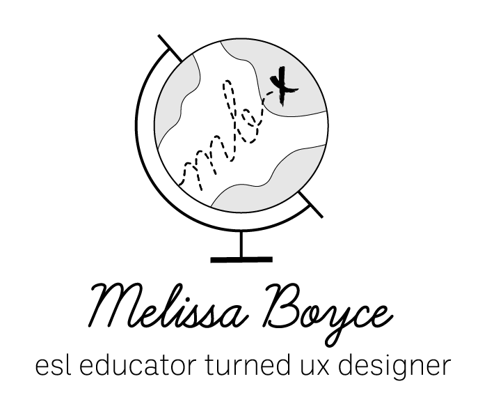
Black and White
Block
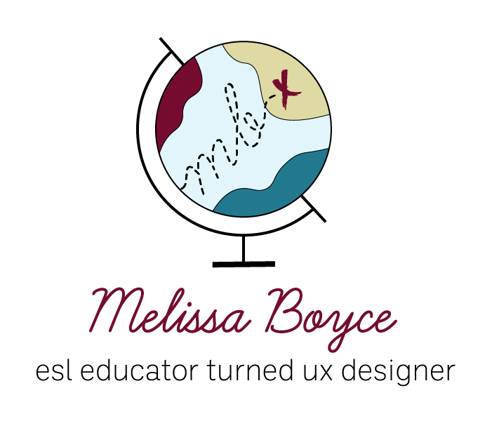
Color
Block
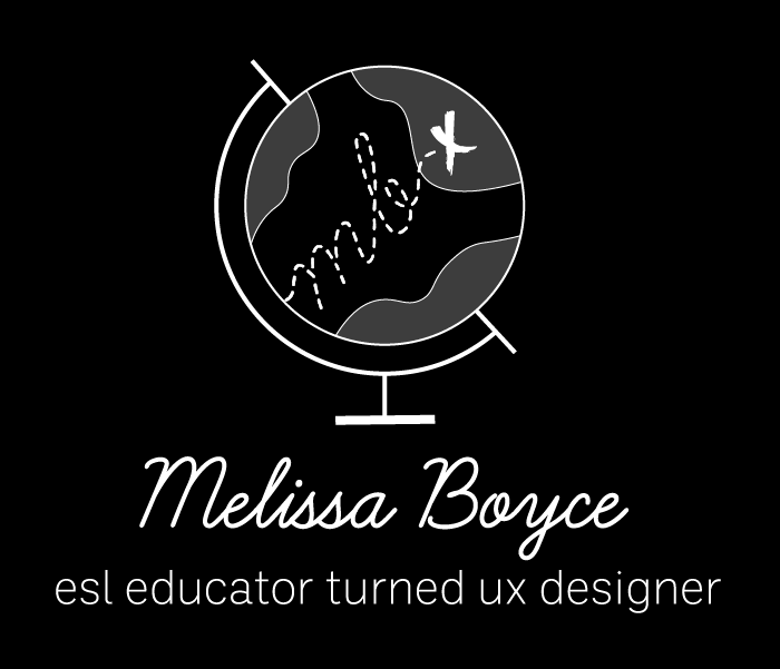
Inverse
Block
Black and White
Wide
Color
Wide
Inverse
Wide
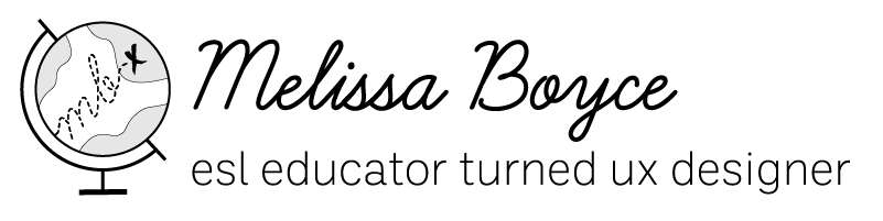
Logo Lockup
Black and White
Full Icon
Color
Full Icon
Inverse
Full Icon
Black and White
Square Icon
Color
Square Icon
Inverse
Square Icon
Icons
Black and White
Full Icon

Color
Full Icon
Inverse
Full Icon
Black and White
Square Icon
Color
Square Icon
Inverse
Square Icon

Color
Mobile Icon

Color
Desktop Favicon Icon
Avoid Misuse
The above logos and icons should cover most use cases. Please do not change colors, distort the shape and aspect ratio, or crop.